What Typical Screen Sizes Would You Design Your Web App
Table of contents
- Most Common Screen Resolutions
- Desktop Screen Resolution Stats Worldwide
- What Are The Best Screen Sizes For Responsive Web Design?
- Fundamentals of Responsive Websites
- Breakpoints and Screen Sizes
- The Importance of Being Google Mobile Friendly
- How Can I Find Out My Screen Resolution?
- FAQ
Most Common Screen Resolutions
While there may not be one single ideal screen size to design web page dimensions for, there are some resolutions that crop up far more often than others. You should pay particular attention for the resolution ranges when designing, as they are the ones you can guarantee will be used on many devices. The following are some of the most common screen resolution options:
- Desktop displays, ranging from 1024×768 to 1920×1080
- Mobile displays ranging from 360×640 to 414×896
- Tablet displays ranging from 601×962 to 1280×800
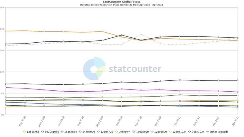
This is a basic breakdown of standard webpage sizes according to devices. In terms of desktop or laptop screen resolutions, analysis of nearly half a million users in early 2021 revealed the following:
- 1920x1080 was the most popular resolution, with 19.53% of the total
- 1366x768 came second, with 15.01%
- 1440x900 came third, with 9.65%
- 1536x864 was fourth, with 7.26%
Desktop Screen Resolution Stats Worldwide

Image Source: https://gs.statcounter.com/
What Are The Best Screen Sizes For Responsive Web Design?
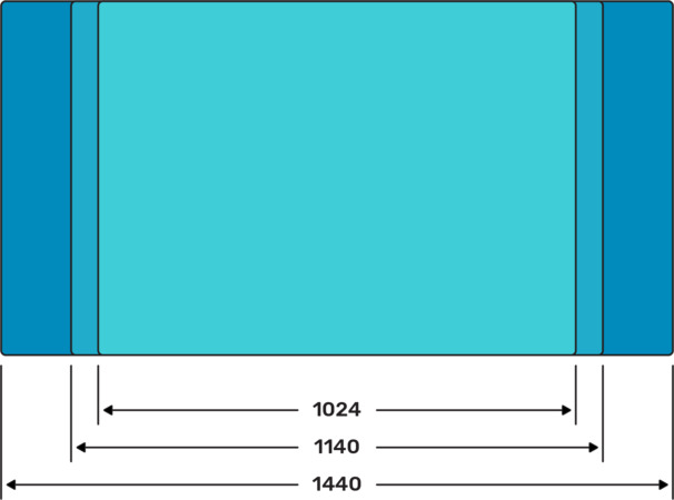
What is the most common screen size for web design? Well, there's no single resolution size that you can rely on for responsive web design. It's more important that you go for versatility, ensuring that your pages function well in a range of different resolutions. That said, there are a few website page size facts that can help in terms of responsiveness. A common size for many design files is 1440 wide, with main content at 1140. Another standard website page width among desktop sizes is 1920. We will cover the fundamentals of responsive web design in the following section.

Fundamentals of Responsive Websites
Website resolutions are one concern. But the following are some of the bare basics that you should familiarise yourself with if you want to improve the responsiveness of your pages.
CSS Grid
The CSS grid is the basic layout of content on a page, regardless of webpage size. It uses a set number of columns, along with a certain amount of gutter space, within which a web designer can place items. A standard setting is 12 columns, with 30px gutter space, but designers can alter CSS grid values depending on what they are working with. The grid takes up the entirety of the container on a page, and the container itself can vary in size depending on browser window or device. CSS grids are crucial for ensuring that content can be viewed exactly how a designer wants it to be viewed on various website screen sizes - it ensures uniformity across different resolutions, reducing the need for things like horizontal scroll bars.
A maximum width is usually set for a container to ensure that content doesn't end up getting stretched across browser widths. This allows the browser to focus on the container, and fill in the gaps on either side with a background colour. It's essential that web designers use a CSS grid effectively, as it's crucial for functional site design. It also goes a long way in ensuring uniformity across a range of different browsers, resolutions and operating systems.
Breakpoints and Screen Sizes
Grid columns are divided proportionally, rather than with a fixed width. As a result, they can become excessively thin on small screens, reducing the visual appeal of the content. This can be avoided by changing object size definitions, so that they adapt to the browser window. When designing a page, you will primarily be focusing on large desktop screens, laptops, tablets and mobile phones. You need to define screen resolution for websites that fit each of these four categories. The width limit of the specifications you define are known as breakpoints. They rearrange content, depending on the resolution that a page is being viewed in.
The Importance of Being Google Mobile Friendly
Unsurprisingly, you need to ensure that your page is Google Mobile friendly. There are a few reasons for this. Basically, when deciding where to place a page in search rankings, Google crawls it to analyse the page and determine its value. There are two different crawlers, one used for desktop and one for mobile. Google performs a preliminary crawl when a page is searched for, and recrawls a few pages on the site to check both mobile and desktop crawlers. However, the important thing is that Google uses their mobile crawler on all new sites. That means that if you lack usability on mobile, your site will get poor results.
This is all part of a general trend. More searches are now being made on mobile devices than on desktop, meaning that mobile devices are slowly becoming our primary, rather than secondary devices. This means that you need to ensure mobile compatibility, no matter who you're working for. Google has also begun factoring in UX to their search result placements. That means that if users have trouble navigating your site and leave quickly, your results will be affected. All this points to the importance of strong design, especially on mobile.
How Can I Find Out My Screen Resolution?
Your screen resolution has a major effect on the way you use your computer or mobile device. There are a number of ways you can find out what your resolution is, depending on what you're using. For PC users, simply right click somewhere on the desktop and select display settings. You will be able to view and change your resolution. There are also a number of sites that let users quickly work out what their screen resolution is.
Screen Resolution Definition
Resolution does not refer to the number of pixels on a screen, know as pixels per inch. Rather, it's the number of pixels per unit of area. It describes the number of pixels arranged horizontally and vertically on a screen, so it's got more to do with dimensions than total amount of pixels.
What Typical Screen Sizes Would You Design Your Web App
Source: https://comparium.app/blog/common-screen-resolutions/
Posted by: pughposion.blogspot.com

0 Response to "What Typical Screen Sizes Would You Design Your Web App"
Post a Comment